sierraclub.org - sierra magazine - jan/feb 2013 - letters from the mountain
Feed Your Children Well | Trendsetter: Lucy Lawless | Drinking Buddies | Letters From the Mountain
LETTERS FROM THE MOUNTAIN
For a prolific typeface designer, Yosemite is a font of inspiration
 After churning out dozens of designs for high-profile clients like Google and Microsoft, typeface designer Steve Matteson—who created the default fonts on the Android and Windows smartphones and the letters players see when they turn on their Xboxes—finally decided to create a set of letters, he says, "for the sake of making myself happy." He looked to the mountains for inspiration.
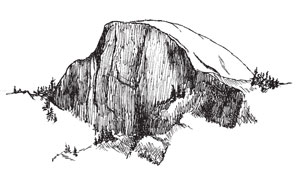
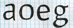
The result was Massif Pro, a typeface that debuted in June and is, as Matteson puts it, "a hidden homage to Half Dome." It's based in part on pencil sketches he made while backpacking in Yosemite National Park.
"One of the best things about the Sierra," he says, "is the unique contrast of glacial polishing with jaggedness—when gradual, smooth curves all of a sudden sharpen off into an abrupt straight line. Those elements are what I put into the typeface." If you look closely, you'll see that Half Dome's exact contour hollows out many of his lowercase letters, including e and o.
Matteson envisions the Massif family (available at fonts.com, starting at $54) being used for "anything outdoorsy or nondigital," like a label on a bag of ecofriendly coffee beans. "It's good for conveying a voice of organic quality."
Most new fonts are designed on computers, which Matteson says "are really good at making straight lines and perfect circles." So to give these letters a more natural look, he drew them freehand with a pencil. "It's one of only a few designs I've done with no customer looking over my shoulder. It was straight out of my head."
When Matteson does contract work, his craft can be mechanical and austere, especially when he labors to create easily readable digital fonts for people who stare at screens all day. But as an avid outdoorsman, he worries that people are spending too much time on smartphones and not enough in the wilderness. "I design typefaces as legibly as I can," he says, "so people can read quickly on their device and then go outside."
—Avital Andrews
Font: Steve Matteson, Monotype Imaging